Design & Ergonomics in e-commerce
Hi,
What do e-commerce customers and mothers-in-law have in common?
A clue: both can be quite demanding and a little lazy making this relationship work.
The answer: you want to make an excellent first impression.
Well, that’s the aim of Design & Ergonomics on your website
Your partner in life has been telling her/his mum about you and so have you with your visitors about your website through marketing.
Once the meeting takes places, it now imports to convert the marketing investment, both with your mother-in-law and your customers of course. Let’s focus on the latter now.
Design and Ergonomics concentrate most of the visitor first assessment of your website so don’t mess up with them! You only have a few seconds, one minute max, to convince that your website answer the needs, both in terms of product offer and customer experience.
4 main types of Design & Ergonomics tools:
- Visual: logo, colour code, illustration, animations, etc.
- Content: product information, trends analysis, direct communication, etc.
- Architecture and customer path: categories organisation, reassuring, FAQs, client support, etc.
- Technical: speed of pages download, bugs with buttons and images, etc.
Each type of tools requires a specific attention and optimization and will reduce your bounce rate while pushing for longer and more frequent visits.
Focus on the category bar
Let’s focus on one specific ergonomics tool: the category bar that helps customers start their research. This bar is probably the most-used tool on your website.
The organization of this bar is specific to each merchant, even though 2 may share the same catalog.
Elements to take into account while designing and prioritizing your category bar:
- Number of categories and their scope
- Too many categories will your offer impossible to read
- Not enough categories won’t allow the customer understand your offer
- Each category’s weight in overall sales (including promotions)
- Make it easy for your customers to find what they are looking for but…
- Use it to show them what else you have in store!
- Your strategic goals by category: market penetration, volume increase, price image, margins increase, etc.
- Make your strategic priorities more visible
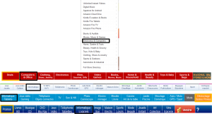
Let’s compare 5 examples coming from generalist merchants, American or French. We’ll have a closer look at 2 categories: computers (black outline) and promotions (orange outline).
Computers
Computers and tablets are often located on the left of the category bar: they drag traffic to the merchant and must be easily found by customers, all the more that it is a very competitive category and you’ll lose customers if they don’t have easy access!
Promotions
They can be located
- At the left : visitors see them immediately and may click directly on the link
- At the right or Elsewhere : promotions need to be looked for and will make the visitor have a broader look at the website
First group seems to be on a price aggressiveness and penetration strategy: increasing volumes and gaining market shares
Second group seems to be using promotions to drag customers and then show them a larger part of the catalog.
Obviously, there is no rule that applies to all merchants in Design & Ergonomics, each one having its specific average customer profile and strategic objectives!
See you next week to talk more about Pricing and Promotions!
Ezako Team


