“Web Ergonomics”
Tuesday #14
What is in there for you ?
Themes : e-commerce, UX
 As many actors on the e-commerce market talk about website ergonomics, we thought it would be nice to go through the basics once again to see how to make ergonomics (and UX in general) your competitive advantage.
What is ergonomics ?
3 important points
Ergonomics is the science of making your visitors feel comfortable while navigating on your website, in order for them to stay for a while, find what they want and come back. It is making the user’s life easier without him noticing your presence.
In 3 words, it is the optimization of the user experience (UX).
→ Human vs Machine
Web ergonomic is at the meeting point of your user and your website, or in other words, the human and the machine. It is important to respect the visitors need for instinctive behavior, and smoothen the separation between the technology and the human brain.
→ Useful and Usable
As any product or service, your website must be an answer to a need. For example, you built an online store for your brand because people want to see and buy your clothes. Or for people to use a loyalty card. It needs to be useful to your target customers.
But, to keep your visitor satisfied at all times, you must make it easy to use by the persons navigating: their goals have to be easy to achieve. It is not sufficient enough to have a website, you have to make it usable.
→ Your visitor is not you
Although you share some common intuition. Let’s come back to the notion of comfort, security and simplicity that the word “ergonomic” carries. You know the product, he does not. But he reacts to the same rules as you do. For example :
• The proximity law
We associate things that are close to each other together
• The similarity law
We associate thing of the similar shape or similar color to a similar action
• The size law
We associate big element to clic
Is there any rule ?
3 basic rules we consider unavoidable
→ Architectures is not only about the overall website map
One thing has been understood : the sitemap organization is important. Your visitor should always know where he is, where he can go, and it should be logic. You got it. Still something is often forgotten with web architecture, webpage architecture : each page has to be clear and clean
→ Be coherent in your design … Everywhere
… and coherent with others. Meaning that call to actions have all to be of the same color, shape, size, whatever the page is, if they call to the same action. Also, the colors you used have to be coherent with your graphic code, for brand recognition.
For example, on an E-commerce website, use your flash color to “add to cart”, and your light color for “back to category”.
→ Your visitor needs (discrete) advices
Visitors have to feel they are completely free in their navigation. But at the same time, they need you to guide them. They need to feel that the company cares about them.
Examples
Complete freedom : “back to top”, category navigation bar on top, search bar, “same category” module, “already seen” module.
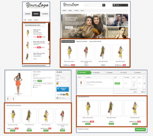
Guidance : “others also liked” sections, “Mothers’day promotions” sections, “similar products” sections
Caring : Personalized search bar, “recommended for you”, “you will also like”, “your favorite items in promotion” …
Going further
Ergonomic is not a static discipline anymore. Adding real time inventory and behavior based updates to it not only shows that you care, but it also optimizes your user’s shopping experience. With an interactive interface for your E-commerce, you trigger your visitors impulsive purchase decision process and insure your ROI.
Share your opinions or questions with us, we are interested!
Or send us a mail at : commerce@ezako.com
See you next Tuesday !
You would like us to write about something? Send us a mail: commerce@ezako.com or contact us via our facebook page EZAKO, or twitter account @BigDataEzako

